Ecosa
Website localisation / Advertising design for e-commerce company
Year
2022 June
Client
Ecosa Japan
(ECOSA株式会社)
Role
Localisation from English to Japanese / Market research / Redesign visual and layout / Proofreading / Advertising design
Overview
Ecosa is an Australian mattress-in-a-box company.
The company entered the Japanese market in 2021. I was responsible for localising the website and creating social media ads to culturally fit to the Japanese market.
Localizing + Redesign
The project involves localizing and redesigning a website, which includes market research, proofreading copy, updating visuals on the homepage and product pages, and arranging a photoshoot with Asian models. The primary goal is to provide Japanese users with a culturally relevant experience and ample information while preserving Ecosa's minimalist and stylish aesthetic.
Product list design
All products are displayed with brief information so that customers can easily compare each product. Tags are added for sales and new product launches.
Unique Selling Point
The USP is the free 100 night trial. Since there are still many Japanese customers who are not comfortable with this new system or with buying mattresses online (and it’s a new foreign brand on top), an emotional connection with the user is essential. So to tackle this problem, I approach customers by raising issues such as a mattress that does not fit after trying it for a few minutes in the store.
Meeting customer needs
The product page provides the necessary information with the simple layout, making the purchasing decision fast and easy. The page is also the first page customers see if they click ads. In order to minimise a bounce rate, product summary and USPs are placed at the top of the page so that customers can quickly get to the information they want before they leave.
Design for mobile users
According to Google Analytics, over 95% of the visitors were on mobile. Since mobile screens are small and cannot show a lot of information at the same time, the information is arranged in the order the users want.
Customer reviews placed at the top of the page
Ecosa is a foreign brand, having customer reviews was crucial to gain the trust. The reviews are usually located at the bottom of the page but showing the review (from Yotpo) at an early point enables to appeal to their emotions before they lose their interest.
・Campaign information on the discount bar
・Discount tag added, highlighted in red
Sales banner
Popup design
・Make the percentage discount clear
・Match the style and colour palette
・Cozy and luxurious colours
・The secondary colours are to showcase labels for sales information, new products.
Colours
Primary
#012848#E8E6DF#F2F2EF
Secondary
#93CDDF
#AA0421
Neutral
#333333
#6A6A6A
#FFFFFF
Typography
・Legible and versatile

Website prototype
These ads were made to encourage a short-term boost in revenue.
Sales were approximately 10 times higher than average sales during the campaign period.
Social Media Ads
The purpose of this carousel ad was to increase credibility through real user testimonials obtained from Yotpo. Using user reviews, we were able to maintain a CTR of 1.5~2% at all times and achieve ongoing sales (Ad Clicks ÷ Ad Impressions = Click-Through Rate *2% is considered a good result in general speaking).
Testimonial Ads
Collaborating with influencers has been an effective way to showcase its products in different styles of bedrooms and resulted in increasing the amount of website traffic by 51%.
User Generated Content Ads
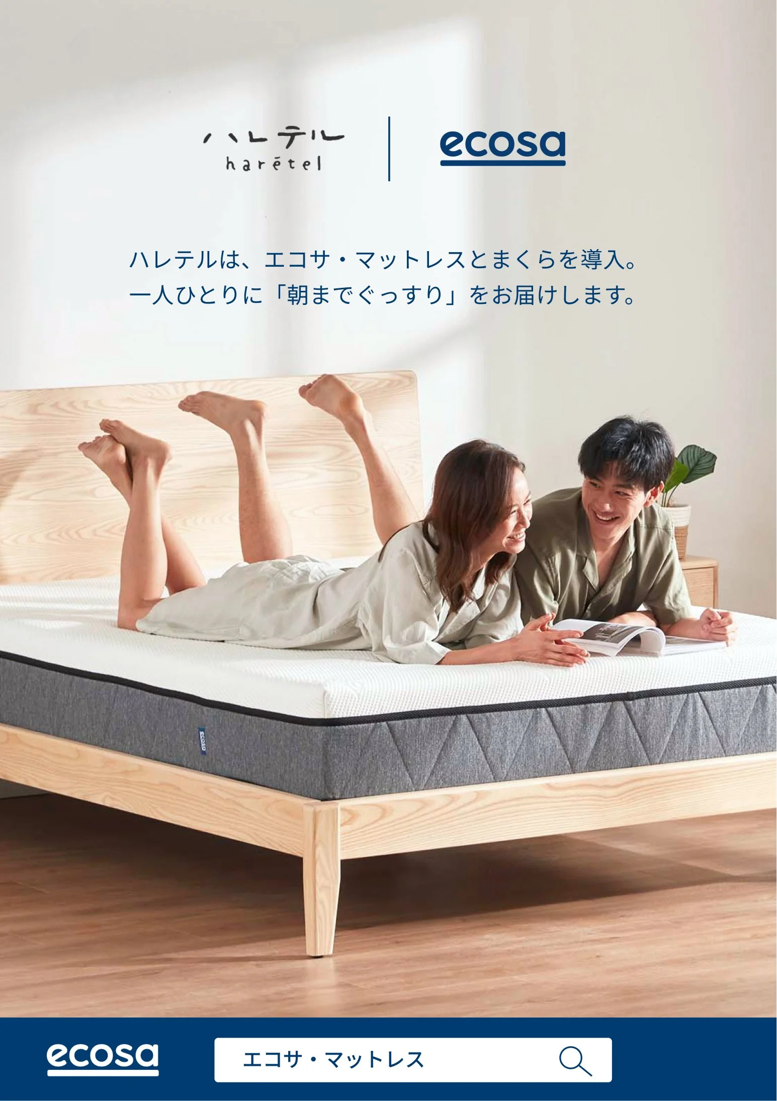
Flyer stand for a guest house.


